Quantum logo design sits in a difficult middle ground: the brand has to signal technical depth, future relevance, and enterprise trust without falling back on the same orbit rings, glowing particles, and generic “science” marks that already crowd the category. This guide is designed as an annual-update resource for founders, designers, and technical teams who want to track recurring patterns in quantum computing branding, review what is becoming overused, and make sharper identity choices. If you are building a new mark or refreshing an existing one, use this article to evaluate styles, symbols, and clichés before they become expensive habits across your website, pitch deck, product UI, and sales materials.
Overview
A strong quantum logo design does not need to explain quantum mechanics. It needs to make the company legible, credible, and distinct. That sounds obvious, but many teams still treat the logo as a miniature diagram of entanglement, a qubit Bloch sphere, or an abstract wave field. The result is often visually familiar but strategically weak.
In quantum computing branding, the logo rarely works alone. It is the smallest piece of a larger identity system that includes typography, color behavior, iconography, diagrams, motion, investor materials, and the way technical claims are framed on a website. That is why trend watching matters. A symbol that felt fresh two years ago can quickly turn into category wallpaper once ten adjacent startups adopt the same visual shortcut.
The most useful way to review quantum visual identity trends is not to ask, “What looks futuristic?” but to ask a tighter set of questions:
- Does the mark create recognition at small sizes?
- Does it feel specific to the company’s positioning, not just the sector?
- Can it scale across hardware, software, research, enterprise sales, and hiring contexts?
- Does it rely on a visual cliché that may age faster than the company itself?
- Would the mark still work if the viewer knew nothing about quantum computing?
Those questions keep the discussion practical. They also help teams avoid a common problem in branding for quantum startups: overexplaining the science while underbuilding the identity.
As a working rule, the best brand identity for quantum computing companies usually does one of three things well: it simplifies complexity into a memorable form, it borrows trust cues from established enterprise technology design, or it creates a distinctive system around a restrained mark rather than overloading the logo itself. All three approaches can work. The risk appears when a team tries to do all of them at once.
If you are still shaping the verbal side of the brand, it helps to pair this review with a naming audit. See Quantum Company Naming Guide: What Works, What’s Overused, and What to Avoid and Qubit Naming and Branding: Positioning Quantum Products for Enterprise Adoption for the positioning choices that should inform visual direction.
What to track
The most useful tracker for deep tech logo design is not a list of colors or styles in isolation. It is a list of recurring motifs, category signals, and failure modes. Review the following areas when assessing quantum startup branding.
1. Symbol families that keep repeating
Certain shapes appear again and again in quantum logo design because they are easy shorthand for “advanced science.” That does not make them unusable, but it does mean they need careful handling.
- Orbit rings and atomic structures: These are among the oldest science clichés. They can still work if reduced into a sharp, ownable geometry, but most versions feel generic or educational rather than premium.
- Waveforms and sine curves: Useful when the brand leans toward photonics, sensing, or signal behavior. Less useful when they are included just to imply abstraction.
- Node-and-edge networks: Familiar in AI, cybersecurity, cloud, and biotech. In quantum company branding, they often blur into broader tech branding unless supported by a stronger system.
- Qubit grid or lattice patterns: Relevant for hardware or architecture-focused brands, especially if the company wants an engineered, modular feel. The challenge is avoiding visual coldness or overcomplexity.
- Interlocking forms and overlaps: Often used to suggest superposition, entanglement, or hybrid systems. They can be effective, but too many become impossible to distinguish from consulting or software brands.
- Stars, portals, and cosmic gradients: These signal “future” quickly, but they can also make the company look speculative rather than operational.
When you audit the category each quarter, note not just which symbol families are present, but how they are executed. A restrained ring system may feel timeless; a glowing atom icon may already feel dated.
2. Color behavior in the category
Color trends in quantum computing branding tend to oscillate between two poles: dark, high-contrast futurism and clean, muted enterprise minimalism. Both can work. What matters is whether the palette supports the company’s positioning.
- Dark navy, indigo, violet, and cyan: Common because they imply depth, advanced computing, and precision. Overused without differentiation.
- Black plus electric accent colors: Strong for launch materials and event visuals, but can feel theatrical if the company sells long-cycle B2B solutions.
- Soft neutrals with one technical accent: Often more credible for enterprise software, developer tools, and infrastructure layers.
- Green-blue spectral gradients: Visually attractive, but easy to confuse with AI, fintech, or cloud branding.
Track whether color is being used as a primary identity feature or as a background effect. Many quantum brands depend too heavily on atmospheric gradients because the logo itself lacks enough distinctiveness. That can work on a website hero but often breaks down in documentation, diagrams, social avatars, and monochrome use.
3. Typography choices
Typography is often a stronger differentiator than the logo symbol. In scientific company logo design, teams sometimes spend weeks refining an abstract mark and then pair it with an unremarkable geometric sans that removes all personality.
Track these patterns:
- Overuse of ultra-clean geometric typefaces that feel interchangeable across SaaS and AI
- Wordmarks with subtle custom cuts, terminals, or spacing that create distinction without sacrificing legibility
- Monospaced or semi-monospaced accents used to suggest technical credibility
- High-contrast editorial typography used to balance technical complexity with authority
If the symbol is abstract, the wordmark often has to do more brand work. This is especially true in quantum software branding, where the product may never be seen physically and recognition must travel through screens, slide decks, and documentation.
4. Literal science references versus strategic abstraction
One of the core choices in quantum brand design is how literal to be. Some teams want the logo to directly reference a qubit, chip layout, photon path, or wave interference pattern. Others want a cleaner abstract symbol that simply feels precise and modern.
Track where your own brand sits on that spectrum and whether it still matches your audience. Literal references can help in early-stage storytelling, especially with technical buyers or investors who want category confidence. But they may become limiting if the company expands into broader enterprise tooling, consulting, middleware, security, or adjacent hardware applications.
A useful test: if you remove the science explanation, does the mark still feel intentional? If not, the logo may be functioning more as a classroom illustration than a durable brand asset.
5. The cliché list to watch
Some motifs are not wrong, but they should trigger a harder review because they are frequently overused in branding for deep tech startups:
- Glowing particle swarms
- Infinite loop forms that claim to represent entanglement
- Hexagonal grids with no clear strategic link
- Nebula textures and outer-space references used as default futurism
- Random “Q” lettermarks with orbit tails
- Complex line art that disappears at favicon size
- Pseudo-scientific diagrams inserted into the logo itself
If your logo depends on one of these devices, the question is not whether it is allowed. The question is whether your execution is distinct enough to survive category crowding.
For a broader identity review process, pair this with Quantum Startup Branding Checklist for 2026, which helps translate visual choices into a fuller brand system.
Cadence and checkpoints
Trend tracking only becomes useful when it is scheduled. For most teams, a quarterly review is enough. Early-stage companies moving fast on fundraising, product launches, or replatformed websites may benefit from a lighter monthly check.
Use this cadence:
Monthly light check
- Review recent competitor homepage updates
- Note recurring visual motifs in newly launched quantum startup websites
- Check whether your own logo still holds up in social avatars, event sponsorships, and small-format placements
- Record any new pattern you are seeing repeatedly, even if it is still early
Quarterly brand audit
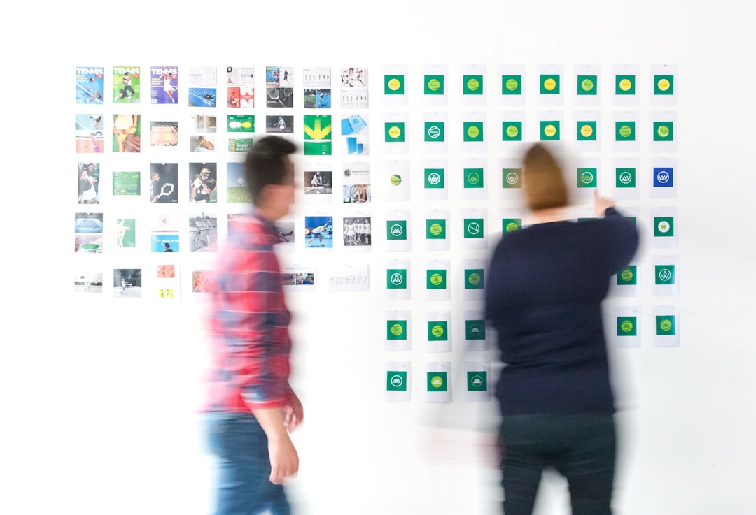
- Collect 15 to 30 logos from direct and adjacent competitors
- Group them by symbol family, palette, and typography
- Identify which choices are becoming category norms
- Compare your mark against your current positioning statement
- Test your identity in monochrome, on dark and light backgrounds, and at small sizes
- Review whether the website, pitch deck, and product visuals still feel part of the same system
Annual strategic review
- Revisit the role of the logo inside the broader visual identity
- Assess whether the company has outgrown an early-stage science-heavy symbol
- Decide whether to refresh, refine, or leave the mark unchanged
- Update internal guidelines so new materials do not drift away from the core identity
This cadence is especially useful for research spinouts and technical founding teams. In those settings, the first logo is often created quickly to support a funding round or launch page. The annual review is where the brand can mature from “we needed something” to “this reflects who we are now.”
How to interpret changes
Not every pattern deserves a reaction. A common mistake in quantum visual identity work is treating every new aesthetic wave as a signal to redesign. Usually, it is more helpful to separate meaningful category shifts from surface-level noise.
When a trend is worth paying attention to
- It appears across multiple parts of the market: not just one prominent startup, but hardware, software, photonics, and tooling brands.
- It changes buyer expectations: for example, the category moves toward cleaner, more enterprise-ready presentation and your brand now feels overly academic.
- It exposes a weakness in your system: perhaps your symbol is usable, but your typography and color choices make the brand blend into generic AI competitors.
- It reflects a real shift in positioning: such as more quantum firms selling practical infrastructure instead of abstract future vision.
When a trend should probably be ignored
- It is mostly decorative and does not improve recognition
- It only works in large-format hero graphics, not in practical brand assets
- It pushes the identity toward visual complexity without improving clarity
- It makes the brand feel fashionable but less credible to enterprise buyers
Interpretation should always come back to the company’s commercial context. Quantum hardware branding may need sturdier, engineered forms and a stronger industrial feel. Quantum software branding may benefit from a more flexible, interface-friendly identity. Photonics startup branding may legitimately use light behavior or wave logic where other teams would only be borrowing those forms superficially.
There is also a useful distinction between trend-aware and trend-led. A trend-aware team knows what is overused and adjusts execution accordingly. A trend-led team follows whatever looks current and risks rebuilding the brand too often. For deep tech brands, the first approach is usually healthier. Buyers in this space value clarity, trust, and continuity more than visual novelty for its own sake.
If your brand messaging also needs tightening, especially for technical-to-commercial translation, it can help to review adjacent content on the site such as Quantum Machine Learning for Engineers: Practical Use Cases and Implementation Guide or Benchmarking Quantum Hardware: Metrics and Labs for IT Admins. Even technical articles reveal the language patterns your visual identity has to support.
When to revisit
Revisit your quantum logo design when the business changes, not just when the design team gets restless. The most practical trigger points are predictable, and they usually happen before a full rebrand is discussed.
Schedule a formal review when any of the following occurs:
- You are moving from research credibility to enterprise sales credibility
- You are launching a new website or rewriting key landing pages
- Your pitch deck has become more important than your research summary
- Your company has expanded from a narrow technical claim into a broader platform story
- Your product line now includes software, hardware, services, or tools that the original mark did not anticipate
- Your logo performs poorly in partner pages, conference signage, social icons, or UI contexts
- You notice three or more direct competitors converging on your same visual language
When you revisit, do not start with “What should the new logo look like?” Start with a short audit:
- Write the current positioning in one sentence. If the team cannot agree on that sentence, the logo is not the first problem.
- List the top five visual associations in your category. Mark which ones you use today.
- Test your logo without effects. Remove gradients, glows, and motion. Does the core mark still hold?
- Review small-size performance. Favicon, GitHub avatar, slide corner, conference badge, and mobile header are practical tests.
- Audit the whole system. Sometimes the logo is fine, but the surrounding typography, layout, and color treatment are making the brand feel generic.
- Decide whether you need a refresh or a rebuild. A refresh adjusts execution. A rebuild changes the underlying idea.
For many teams, the right answer is not a dramatic redesign. It is a narrower, more disciplined system: fewer effects, better typography, stronger spacing rules, clearer iconography, and more consistent use across the website and decks. That kind of refinement often does more for quantum computing branding than a completely new mark.
As a recurring practice, keep a simple tracker document with screenshots, notes on category motifs, and your own quarterly observations. The goal is not to chase trends. It is to notice when your brand is drifting toward cliché, when the market is shifting toward new trust signals, and when your current identity no longer matches the company you are becoming.
If you want this article to stay useful, return to it on a quarterly cadence and ask three questions: What visual shortcuts are becoming crowded? What signals now communicate trust in this market? And what part of our identity feels most generic relative to our actual technical strength? Those answers will usually tell you whether to stay the course, refine, or rethink.