Most quantum teams do not need a 100-page brand book. They need a practical starter system that helps founders, researchers, marketers, and designers make consistent decisions under time pressure. This guide shows what to include in lightweight quantum brand guidelines, how to adapt them by scenario, what to double-check before publishing assets, and when to revisit the system as your company, product, and audience evolve.
Overview
A useful set of quantum brand guidelines should reduce friction, not create more of it. In early-stage quantum startup branding, the goal is usually simple: make the company look credible, sound clear, and stay consistent across the touchpoints that matter most. That may include a website, pitch deck, product screenshots, conference booth, technical one-pager, hiring posts, and a few social assets.
For most teams, a practical starter system can fit into one shareable document plus a small asset folder. It should be lightweight enough that people actually use it and structured enough that it scales when new stakeholders join. That is especially important in quantum computing branding, where the brand often has to bridge multiple audiences at once: technical buyers, investors, partners, researchers, candidates, and non-specialist executives.
A starter brand system for a deep tech company should usually cover six core areas:
- Brand foundation: what you do, who it is for, why it matters, and how you want to be perceived.
- Messaging basics: core positioning, approved company description, proof points, and language to avoid.
- Logo usage: primary lockup, spacing, minimum size, and misuse examples.
- Color and typography: a restricted system that works across web, deck, docs, and diagrams.
- Imagery and graphics: how to handle abstract scientific visuals without falling into clichés.
- Application examples: website hero, slide cover, social card, document template, and diagram styling.
If you are building branding for quantum startups, the key challenge is rarely lack of complexity. It is excess complexity. Teams often over-explain the science, under-define the message, and end up with a visual identity that looks either generic enterprise SaaS or overly academic. Good quantum brand design creates a middle ground: precise without being dense, modern without looking trend-driven, and technical without feeling inaccessible.
A practical document should answer the questions people ask every week, such as:
- What is our one-sentence company description?
- How do we describe the difference between our platform, hardware, and software?
- Which logo file should go on a dark background?
- What colors are safe for charts, diagrams, and website calls to action?
- Can we use atoms, waves, qubits, and circuit patterns in illustrations, or should we avoid them?
- What tone should we use for investor-facing versus developer-facing content?
If your team cannot answer those questions consistently, you do not need more creative exploration yet. You need clearer brand guidelines.
For adjacent guidance on positioning, see Brand Positioning Examples for Quantum Hardware vs Quantum Software Companies. For naming-related decisions, see Quantum Company Naming Guide: What Works, What’s Overused, and What to Avoid.
Checklist by scenario
Use this section as a working brand guideline checklist. Not every company needs every item on day one, but each scenario below suggests the minimum documentation worth creating.
1. If you are pre-seed and need a usable startup brand system fast
Your objective is speed and consistency. Focus on the assets that will appear in fundraising, recruiting, and your first website.
- Company summary: 1 short sentence, 1 medium paragraph, and 1 technical description.
- Positioning statement: audience, problem, approach, and differentiator.
- Brand attributes: choose 3 to 5 traits such as precise, calm, credible, rigorous, inventive, or enterprise-ready.
- Logo set: full-color, monochrome, dark-background, favicon, and icon-only version if applicable.
- Color palette: one primary, two supporting, neutrals, and a clear accent color for actions.
- Typography: one headline font, one body font, plus web-safe fallback rules.
- Voice guidelines: how to sound in headlines, product copy, deck text, and technical explanations.
- Basic applications: homepage hero, pitch deck cover, team slide, and social card example.
This is the minimum viable deep tech brand kit. It is enough to prevent the usual problems: inconsistent wording, random slide design, and a brand identity for quantum computing companies that changes every time someone exports a new asset.
2. If you are a research spinout moving toward commercial buyers
Your objective is translation. You need to preserve scientific legitimacy while becoming understandable to commercial audiences.
- Audience layers: define language for researchers, technical evaluators, enterprise decision-makers, and investors.
- Message hierarchy: what goes in the headline, subhead, proof section, and technical appendix.
- Terminology guide: approved terms, simplified alternatives, and words that require explanation.
- Proof framework: what counts as evidence in your messaging, such as benchmarks, architecture clarity, partnerships, or deployment readiness.
- Visual translation rules: how to turn lab-heavy concepts into diagrams that non-specialists can follow.
This scenario often benefits from aligning brand strategy with commercialization strategy. If that is your stage, read Deep Tech Brand Strategy for Research Spinouts in Quantum.
3. If you are building a quantum website design system
Your objective is trust and comprehension. A quantum website has to do more than look polished. It has to help buyers understand what the company actually sells.
- Homepage structure: hero, problem statement, solution summary, use cases, proof, audience-specific pathways, and call to action.
- Headline rules: no vague claims, no unexplained scientific shorthand, and no inflated future promises.
- Diagram style: line weights, icon logic, data visualization colors, and labeling conventions.
- Button and CTA language: request access, book a technical intro, view architecture, or talk to the team.
- Image standards: when to use product screenshots, team photography, lab imagery, abstract graphics, or illustrations.
- Page templates: solution page, platform page, resource page, hiring page, and contact page.
For many teams, this is where branding for deep tech startups becomes tangible. The website is often the first place prospects judge whether the company feels serious, understandable, and ready for enterprise conversations.
4. If you need investor-facing polish
Your objective is coherence. Investors do not need a complete design system, but they do need a brand that signals clarity of thought.
- Pitch deck cover system: title, subtitle, logo placement, and background treatment.
- Slide typography rules: heading sizes, body text limits, and chart label consistency.
- Narrative language: one approved way to describe category, technical moat, and commercial pathway.
- Data slide formatting: chart colors, footnote style, and callout treatment.
- Founder bio format: a consistent structure for credentials without overloading slides.
Quantum pitch deck design tends to go wrong when teams mix investor shorthand with dense technical language. Brand guidelines can help separate the top-level story from the technical evidence that supports it.
5. If you are refreshing an existing quantum visual identity
Your objective is continuity without drift. Many teams already have a logo and colors, but no system for applying them.
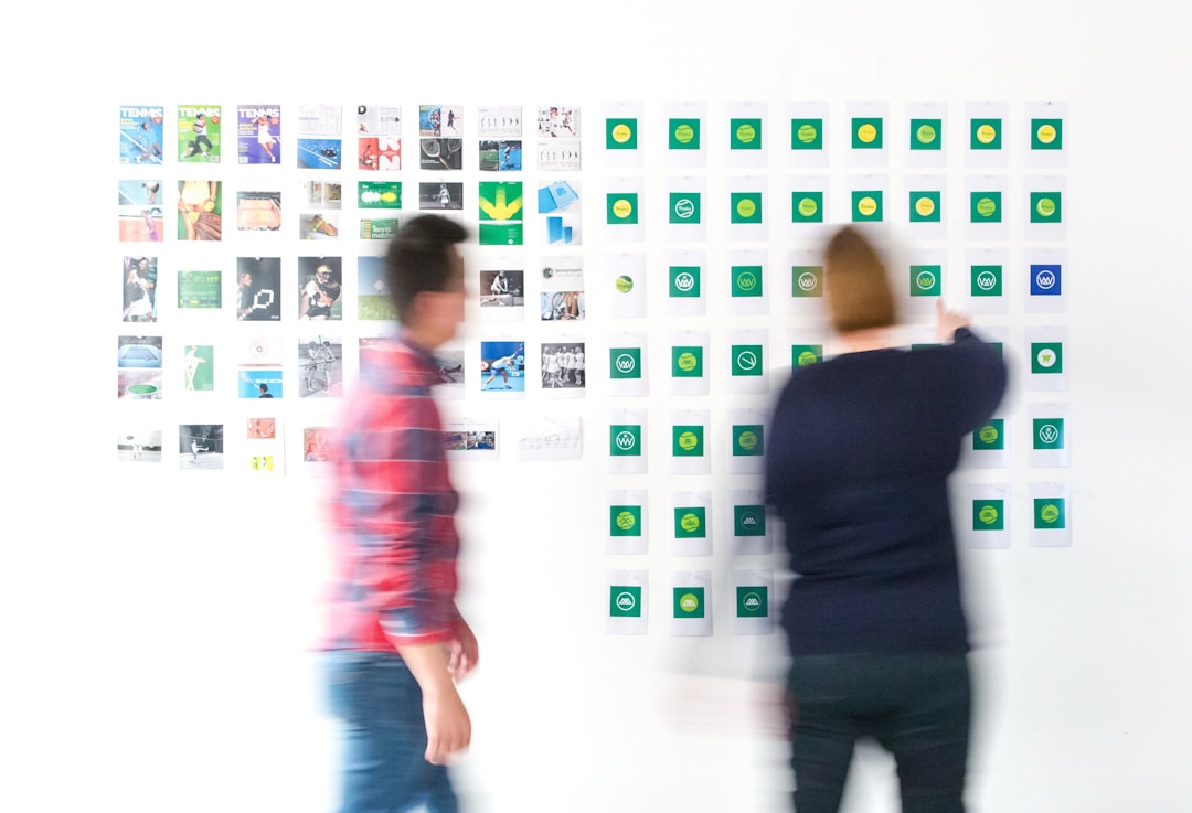
- Asset audit: collect current website pages, PDFs, booth materials, docs, GitHub graphics, and social posts.
- Pattern review: identify what is already consistent and what is causing confusion.
- Priority fixes: tighten logo use, simplify color usage, standardize typography, and unify copy tone.
- Bridge rules: document what stays, what changes now, and what can wait.
- Examples before rules: include real mockups of the updated homepage, slides, and PDFs.
If your visual language feels stale or derivative, reviewing Quantum Logo Design Trends: Styles, Symbols, and Clichés to Watch can help you spot overused motifs before they become part of your next iteration.
6. If your company spans hardware, software, and services
Your objective is architecture. You need to define how the master brand relates to product lines, platforms, or service offers.
- Brand architecture: company brand, product brands, program names, and internal naming logic.
- Descriptor rules: how each offer is labeled in headers, decks, and sales materials.
- Navigation language: avoid making users guess whether an offer is hardware access, software tooling, consulting, or research collaboration.
- Visual differentiation: use restrained color or icon variation rather than building disconnected mini-brands too early.
This is especially relevant in quantum software branding and quantum hardware branding, where a single company may need to explain multiple layers of value without fragmenting trust.
What to double-check
Before publishing your starter system, review these areas carefully. They are small on paper but have outsized impact in practice.
Message clarity
- Can a technical buyer understand the core offer in under 10 seconds?
- Can a non-specialist stakeholder explain your company after reading the homepage?
- Are you claiming an outcome, a capability, or a research direction? The distinction matters.
Consistency across scientific and commercial language
- Do your website, deck, and LinkedIn summary describe the company the same way?
- Are product labels stable, or does the same feature get renamed in each context?
- Are technical terms defined once and reused consistently?
Visual credibility
- Does the identity feel deliberate at small sizes and in plain documents, not just in polished mockups?
- Do charts, diagrams, and technical illustrations follow the same visual rules as marketing assets?
- Have you tested accessibility and contrast for dark-mode or low-light conference environments?
Cliché control
- Are you overusing atoms, infinity loops, nebulas, wireframe waves, or abstract particles?
- Does the logo suggest your actual category, or does it blend into generic frontier-tech branding?
- Have you balanced scientific cues with plain clarity?
Operational usefulness
- Can a new hire find the right logo in under a minute?
- Is the latest approved deck template obvious?
- Are there examples of correct use, not just rules?
Good quantum brand guidelines are not judged by how elegant the PDF looks. They are judged by whether the team uses them without needing constant clarification.
Common mistakes
The most common failure mode in branding for quantum startups is not poor taste. It is under-documentation of decisions that matter repeatedly.
1. Treating brand guidelines as a design-only file
Early brand systems often skip messaging and focus only on logo, colors, and fonts. That leaves teams improvising the most important part: how the company explains itself. In quantum company branding, messaging is often the first thing that breaks because the science is nuanced and audiences vary widely.
2. Writing for insiders only
Founders and researchers sometimes default to language that works in a technical paper, conference talk, or lab context. But brand guidelines should support broader communication. That means defining simplified wording for general audiences without flattening the technical truth.
3. Building an identity around overused symbols
Quantum logo design can drift into a narrow visual vocabulary: orbital marks, glowing particles, circuit rings, and abstract wave gradients. These are not always wrong, but they become weak if they are not tied to a distinctive brand idea. A better approach is to define principles first: what should the brand feel like, what should it signal, and what should it avoid.
4. Overcomplicating the system too early
A startup brand system does not need a full enterprise design system on day one. Too many rules can make adoption harder. Start with the pieces that control perception most directly: positioning, voice, logo use, basic templates, and a small visual system.
5. Ignoring real-world applications
Guidelines fail when they do not show actual usage. Include examples for a homepage section, technical diagram, webinar slide, one-pager, and recruiter post. For quantum startup branding, these examples are often more useful than abstract rules alone.
6. Letting product naming drift
As technical companies expand, internal code names sometimes leak into external messaging. Your guidelines should define how product names appear, when descriptors are required, and what not to expose publicly. This is a small discipline that prevents larger confusion later.
7. Forgetting the buyer journey
A brand that looks polished but does not move users from curiosity to contact is incomplete. This matters in quantum website design especially. Your visual and messaging rules should support conversion: clear calls to action, page structure, proof sequencing, and low-friction next steps.
For a broader operational checklist, see Quantum Startup Branding Checklist for 2026.
When to revisit
A starter system should be stable, but not static. Revisit your quantum brand guidelines when the inputs change, not just when the team feels restless. The most useful review cadence is tied to business shifts.
Plan a review in these situations:
- Before seasonal planning cycles: especially if you are preparing conference materials, fundraising updates, hiring pushes, or a website refresh.
- When workflows or tools change: for example, new CMS templates, slide tooling, design software, or content production processes.
- When your audience mix changes: moving from research credibility to enterprise sales, or from investor outreach to developer adoption.
- When your offering changes: a new platform layer, hardware capability, software product, or service line.
- When team size increases: more contributors means more potential inconsistency.
- When you notice repeated confusion: if people keep asking the same brand questions, the system needs refinement.
A practical review process can be done in one working session:
- Collect the last 10 public brand outputs: website pages, slides, PDFs, event materials, and social posts.
- Mark where language, visual style, or naming differs.
- List the top five questions teammates asked in the last quarter.
- Update the guideline document to answer those questions directly.
- Refresh asset folders so the approved files are easier to find than the outdated ones.
- Add one new application example based on current priorities.
If you want to keep the system usable, think in versions rather than finality. Version 1 should help your current team ship cleaner work. Version 2 should support growth. Version 3 may become a fuller design system. But every version should remain practical.
As a final action step, create these three deliverables this week: a one-page messaging sheet, a one-page visual rules sheet, and a shared folder with approved templates. That small package is often enough to transform a loose collection of assets into a real deep tech brand kit.
And if your team is still defining its market story, pair this guide with Brand Positioning Examples for Quantum Hardware vs Quantum Software Companies and Deep Tech Brand Strategy for Research Spinouts in Quantum. Strong guidelines work best when they document a strategy that is already clear.